


Namaste everyone!🙏 Hope you are doing well, today we are going to build an Accordion component in react from scratch and without using any external library.
Accordion menus are very helpful, you can make a list of items in them. List of inputs like checkbox, radio, etc. I have also implemented this component in my e-commerce project.
In this blog, I'll be using react hooks/react functional components and if you are not familiar with react functional components then this is a good article to read robinwieruch.de/react-function-component.
Table of Contents
- Getting started
- How to Set Up React
- How to create a single Accordion component
- Using "children" prop.
Let's get started,
For this tutorial, we will need some sort of data to display in accordion. We can add it by ourselves also directly into the component but then it would be repeated work and the first Mantra to create a react component is DRY (Don't Repeat Yourself) code.
Below is the data we will need in our code.
const accordionData = {
    title: 'Title One',
    content: `Lorem ipsum dolor, sit amet consectetur adipisicing elit. Quis sapiente
      laborum cupiditate possimus labore, hic temporibus velit dicta earum
      suscipit commodi eum enim atque at? Et perspiciatis dolore iure
      voluptatem.`
  };
How to Set Up React
Create a new project using create-react-app or you can also use an online IDE like codesandbox.io
  npx create-react-app@latest react-accordion
  cd ./react-accordion/
  npm start
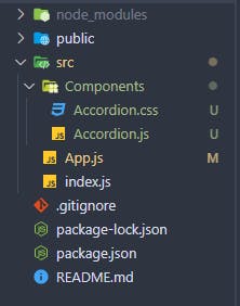
Once the project is created, delete all files from the src folder and create index.js and App.js files inside the src folder. Also, create a new folder with the name Components inside the src folder, and then inside a Components folder create files name Accordion.js and Accordion.css.
Your file structure must look like this :
Now open the index.js file and add the below content:
import React from "react";
import ReactDOM from "react-dom";
import App from "./App";

ReactDOM.render(
  <React.StrictMode>
    <App />
  </React.StrictMode>,
  document.getElementById("root")
);
Open the App.js file and add the following content inside it:
import React from "react";
import { Accordion } from "./Components/Accordion";

export default function App() {
  const { title, content } = {
    title: "Title One",
    content: `Lorem ipsum dolor, sit amet consectetur adipisicing elit. Quis sapiente
      laborum cupiditate possimus labore, hic temporibus velit dicta earum
      suscipit commodi eum enim atque at? Et perspiciatis dolore iure
      voluptatem.`
  };
  return (
    <div className="App">
      <h1>Accordion Component Demo</h1>
       <Accordion title={title} content={content} />
    </div>
  );
}
For now we haven't edited our Accordion.js file. We are just importing it in the App.js only.
Also in App.js, we are added the data to display in accordion.
Now, open the Accordion.css and copy the below content and paste inside it.
.accordion-title {
  border: 1px solid slategrey;
  background-color: #ff2e63;
  font-size: 1.6rem;
  cursor: pointer;
  padding: 0.5rem;
  border-radius: 0.3rem;
  display: flex;
  justify-content: space-between;
}
.accordion-content {
  max-height: 0;
  background-color: #eaeaea;
  gap: 0.5rem;
  overflow: hidden;
  border-radius: 0.3rem;
  transition: all 0.3s cubic-bezier(0, 1, 0, 1);
}
.accordion-content.show {
  max-height: 100vh;
  border: 1px solid slategrey;
  padding: 0.5rem;
  border-top: none;
  transition: all 0.3s cubic-bezier(1, 0, 1, 0);
}
.accordion-input {
  list-style: none;
  margin: 0.5rem 0rem;
  display: flex;
  align-items: center;
}
.accordion-input label {
  margin-left: 1.5rem;
  cursor: pointer;
}
.filter-input {
  margin: 0 6px;
}
For now, we will not look into what this CSS file does and all because this is a specific tutorial for react accordion component. But this is also an important file to have without this our accordion will not work properly.
After that, Open the Accordion.js file and copy the below code and paste it:
import { useState } from "react";
import "./Accordion.css";
export const Accordion = ({ title, content }) => {
  const [expand, setExpand] = useState(false);
  return (
    <div className="accordion-container">
      <div className="accordion-title" onClick={() => setExpand(!expand)}>
        <span>{title}</span>
        <span>+</span>
      </div>
      <div className={expand ? `accordion-content show` : `accordion-content`}>
        {content}
      </div>
    </div>
  );
};
This is it now your Accordion is ready, but let's see what things we are using in this component and what they do to make it interactive.
On the very first line of this code, we are importing an useState hook from react. It is a hook that is responsible for our component state. useState returns two values the first is state and the second is a function to change its state. And importing our Accordion.css file inside our file(This file must be imported otherwise the code will not work).
Now at line no four, we are declaring our state and returning the values [expand, setExpand] from useState to manipulate the state of the accordion. Also, we have given its initial value as a Boolean(false) which can be true/false.
After that our component is returning some HTML-like syntax which is JSX (Javascript in XML).
In the JSX part it is important to have classNames same as given above.
Next we have onClick handler on the div with className="accordion-title" this handler has a callback function () => setExpand(!expand) which updates/sets our component state on every click.
How this callback function is working and hiding/showing the content of Accordion?
The initial value of our expand variable is false on every click on that div we are using our state update function and setting it like setExpand(!expand) which takes the current boolean value of the expand variable and turns it into opposite of it. If the value is true it makes false and if false then true.
Depending on it we are using a ternary operator to hide/show the content div like this className={expand ? "accordion-content show" : "accordion-content"}.
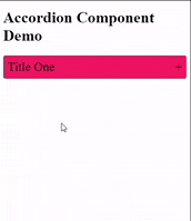
After these changes your output should look like this :
Using "children" prop.
We can also use special "children" prop to make our component more generic. What children prop gives us back is basically the whole code inside the Opening and Closing tags of Accordion.
<Accordion>
// your code = children
</Accordion>
This is more useful when we have to add different things to our Accordion component Ex. checkbox inputs in the first accordion, radio inputs in the second, and a list of some buttons, etc.
To implement this, make sure to update changes in your code:
The first change we have to make is in the App.js file.
We are going to make a "Category" Accordion which will have checkbox inputs in it.
for this example, we will need different data also.
import React from "react";
import { Accordion } from "./Components/Accordion";

export default function App() {
const categoryData= [
    {
      id: 1,
      categoryName: "necklace",
    },
    {
      id: 2,
      categoryName: "rings",
    },
    {
      id: 3,
      categoryName: "bracelets",
    },
  ],
  return (
    <div className="App">
      <h1>Accordion Component Demo</h1>
       <Accordion title="Categories">
         {categoryData.map((item) => {
            return (
            <div key={item.id} className="accordion-input">
              <label htmlFor={item.categoryName}>
                <input
                  type="checkbox"
                  name="categories"
                  id={item.categoryName}
                  className="filter-input"
                  value={item.value}
                />
                {item.categoryName}
              </label>
            </div>
              );
            })}
     </Accordion>
  </div>
  );
}
After that we have to change our Accordion.js file also :
import { useState } from "react";
import "./Accordion.css";
export const Accordion = ({ title, children}) => {
  const [expand, setExpand] = useState(false);
  return (
    <div className="accordion-container">
      <div className="accordion-title" onClick={() => setExpand(!expand)}>
        <span>{title}</span>
        <span>+</span>
      </div>
      <div className={expand ? `accordion-content show` : `accordion-content`}>
        {children}
      </div>
    </div>
  );
};
In this file, we are getting a children props on line number 3 and adding it into the content div on line number 12.
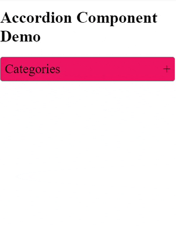
After these changes your output should look like this :
And that's it guys we have created our Accordion component from scratch.
Thanks for reading!
Hope you have learned something new and informative, also do use this component in your projects as well. You can also make it look good by adding more styles to it.
Question
Why did the child component have such great self-esteem?🤷♂️
- Because its parent kept giving it `props!`😄